November 16, 2000
The Sakura Bank, Limited
The Sumitomo Bank, Limited
Symbol Mark and Corporate Colors of
Sumitomo Mitsui Banking Corporation (SMBC)
In advance of the launch of Sumitomo Mitsui Banking Corporation on April 1, 2001 through the merger of The Sakura Bank, Limited (Akishige Okada, President) and The Sumitomo Bank, Limited (Yoshifumi Nishikawa, President), we hereby wish to present the symbol mark, corporate colors and total design that shall be used by SMBC.
| 1. |
Symbol Mark |
|
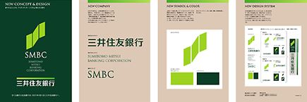
The symbol mark consists of three quadrangles arranged in a positive-sloping curve. The three quadrangles are designed to emphasize a sense of rhythm, expressing growth and development, that is sometimes dynamic and sometimes steady.
The symbol mark, which we call the "Rising Mark", represents our hope that SMBC will enjoy positive development together with its customers, shareholders and society at large by continually providing them with valuable services. |
| 2. |
Corporate Colors |
| |
SMBC's corporate colors are "fresh green" and "trad green". "Fresh green" (color of young grass), used in the Rising Mark, expresses youthfulness, intellect and gentleness. "Trad green" (deep, dark green), mainly used in the background of the Rising Mark and in the lettering of SMBC's name, represents tradition, reliability and stability.
|
| 3. |
Total Design |
| |
We will employ and develop the totally coordinated design - a combination of the Rising Mark, corporate colors, the "SMBC" abbreviation and the bank's English name - actively and effectively. |
The symbol mark, corporate colors and total design
that shall be used by SMBC.
 |
Copyright(C)2000 THE SAKURA BANK, LIMITED |
